CancerConnect iOS App
Telehealth mobile application that serves as a knowledge base and communication tool for cancer patients.

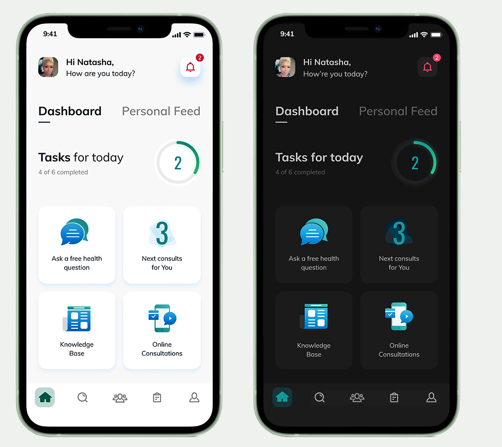
Dashboard & Personal Feed
The dashboard is the central location of the app. As the app learns from the user’s behavior, the dashboard will display the information most applicable to the patient’s journey.
This sketch stems from the ideation phase, aiming at finding the best way to create a simple and intuitive dashboard. I was playing with the idea of displaying varying kinds of information at different times in one or two tiles, depending on the patient’s journey (asking questions, next consultations, knowledge base, clinical trials, available medical documents, potential treatments, recordings, bookmarked articles, etc.).
I thought it was necessary to keep steady content in the other two tiles to create a balance between the newly available content and maintaining a sense of grounding in content the user remembers from previous app visits.
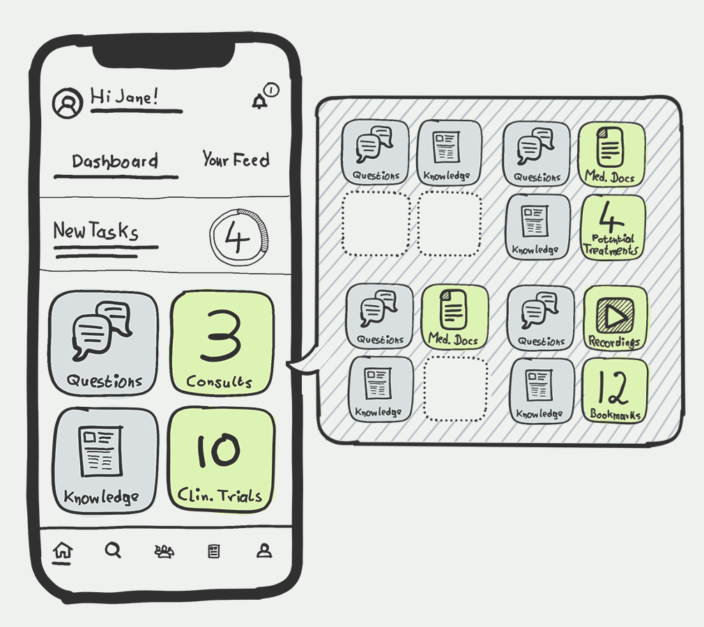
As the dashboard will provide tasks for the patient to complete, activities and areas of interest, the personal feed will provide the latest articles, posts, and other information applicable to the patient’s journey.
I have also provided the opportunity for the app to switch to dark mode at night time.
The personal feed provides the latest information and articles based on the user’s behavior, consultation results, and possible treatment details.
The ‘Tasks for today’ screen can be accessed from the dashboard screen.
Notifications are called out in the top right of the dashboard and personal feed screens and serve as reminders.

Knowledge Base
The Knowledge base with the latest articles from sources the user decided to follow. The second tab shows answers from the database that are in the ballpark of the user’s questions and the option to ask a question. The database is populated with knowledge base articles from trusted sources, verified from a team of professionals. Articles usually provide additional knowledge such as conditions, symptoms and possible treatment information.
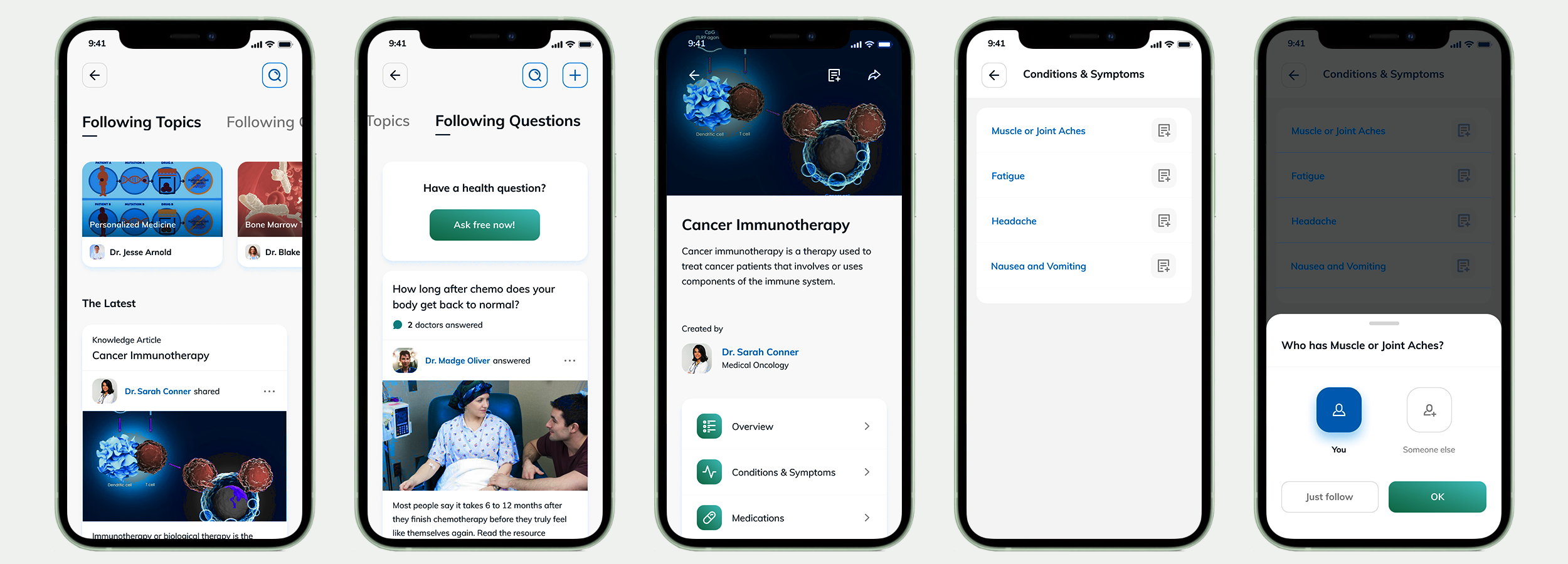
The Search Section
The main search interface with trending topics, articles, answers, and a specialty search to find doctors.
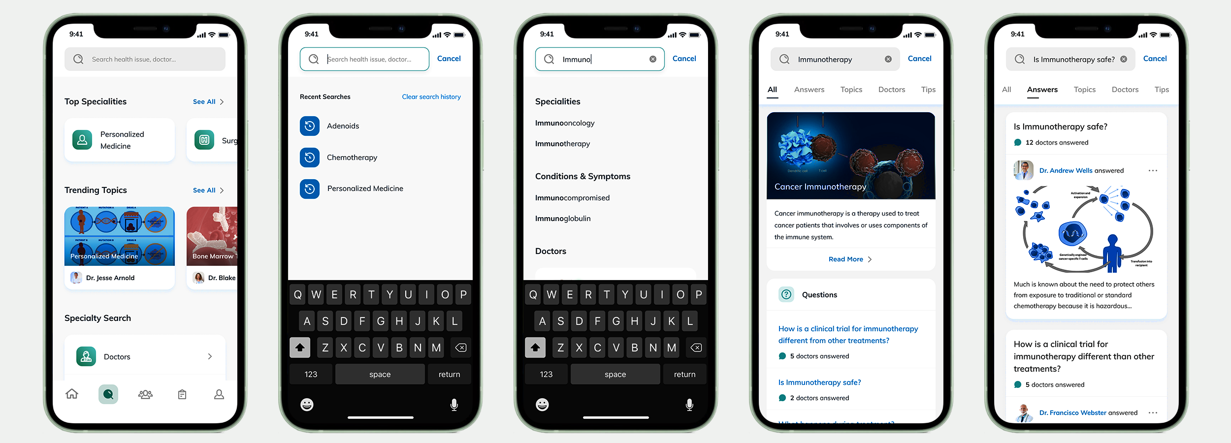
Searching for doctors in the patient’s surrounding area and information about the facilities where they perform their services.
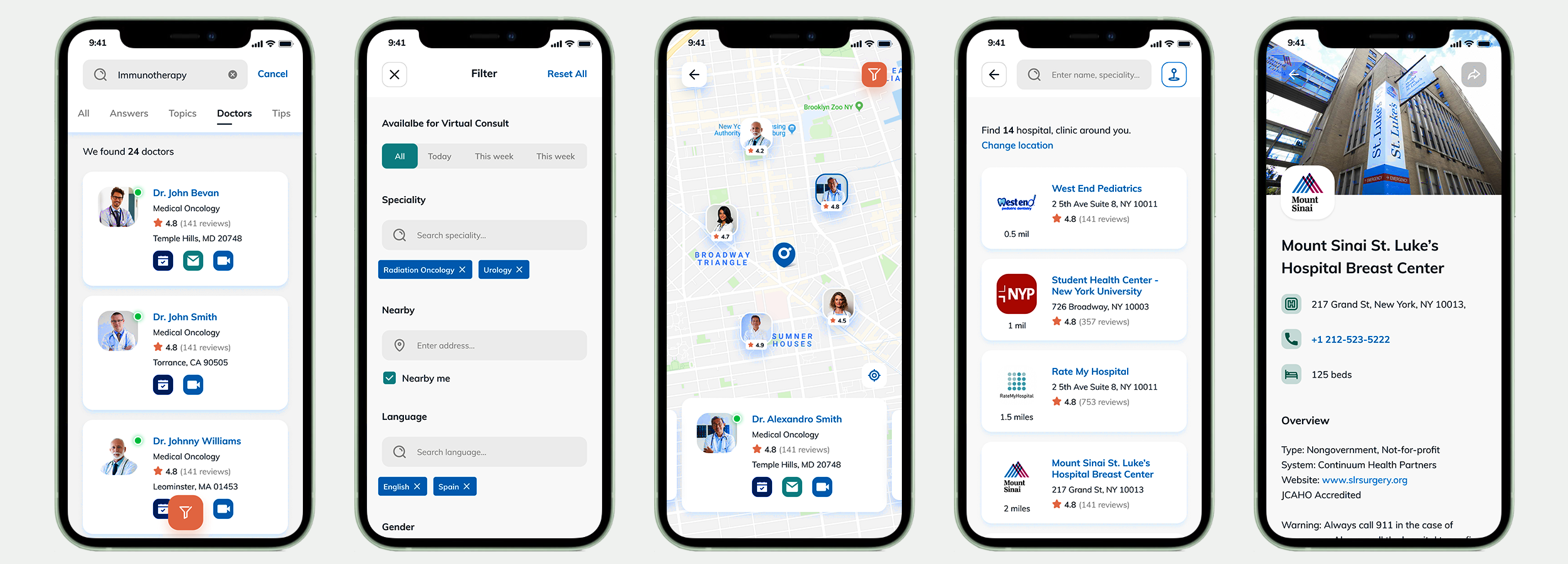
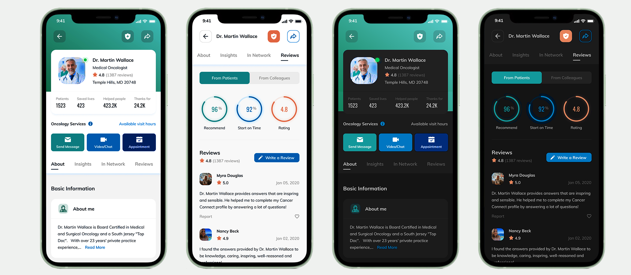
Doctor UI
Several layers of information are provided before the user decides on a particular physician, in light and dark mode.
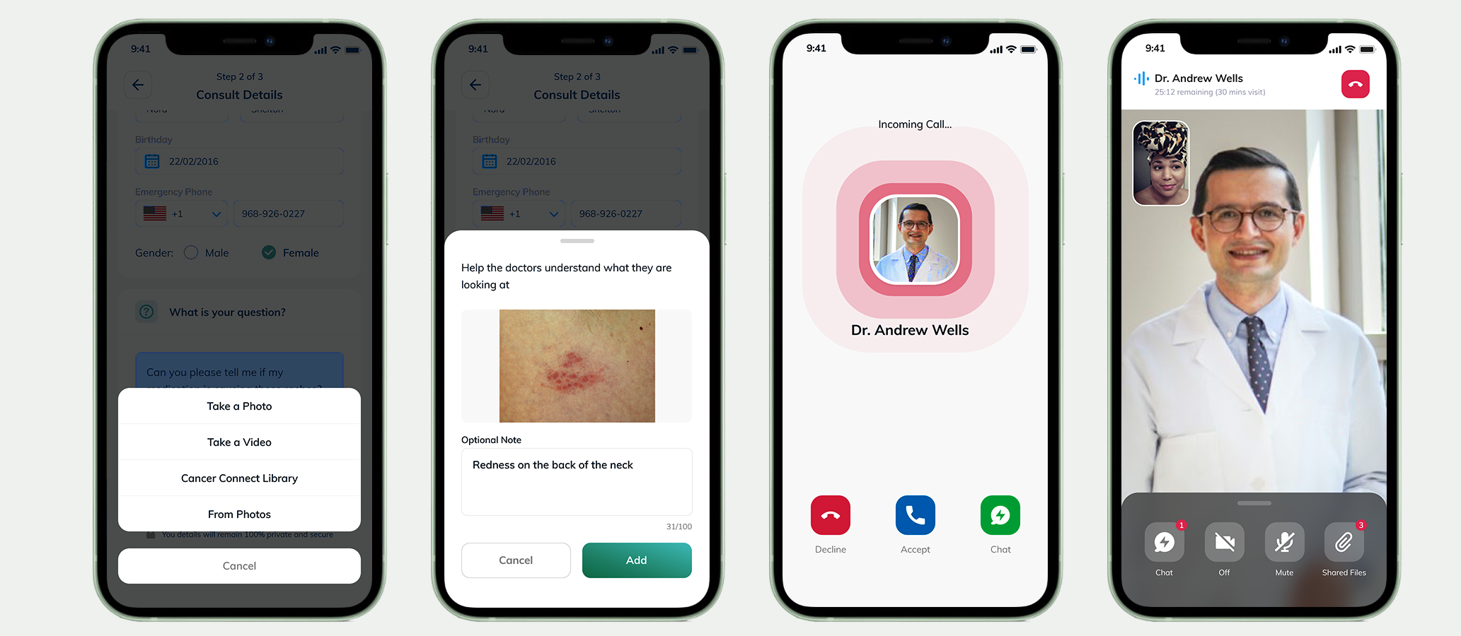
Consulting session
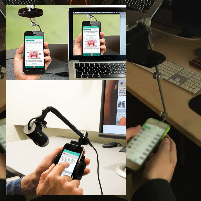
The user has the option to upload images for clarification during the consultation.
This flow was created before the app’s design to communicate effectively with developers and other team members.
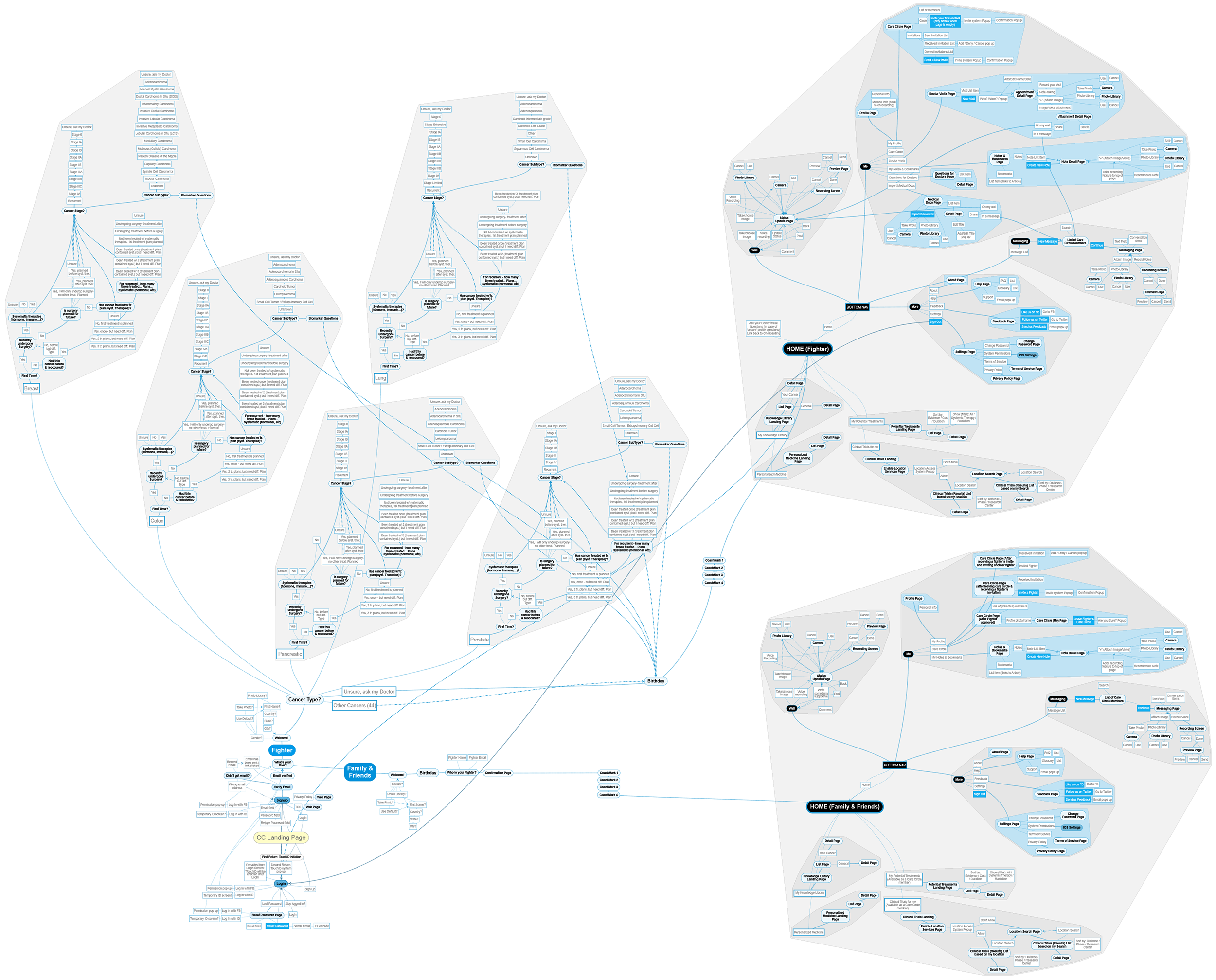
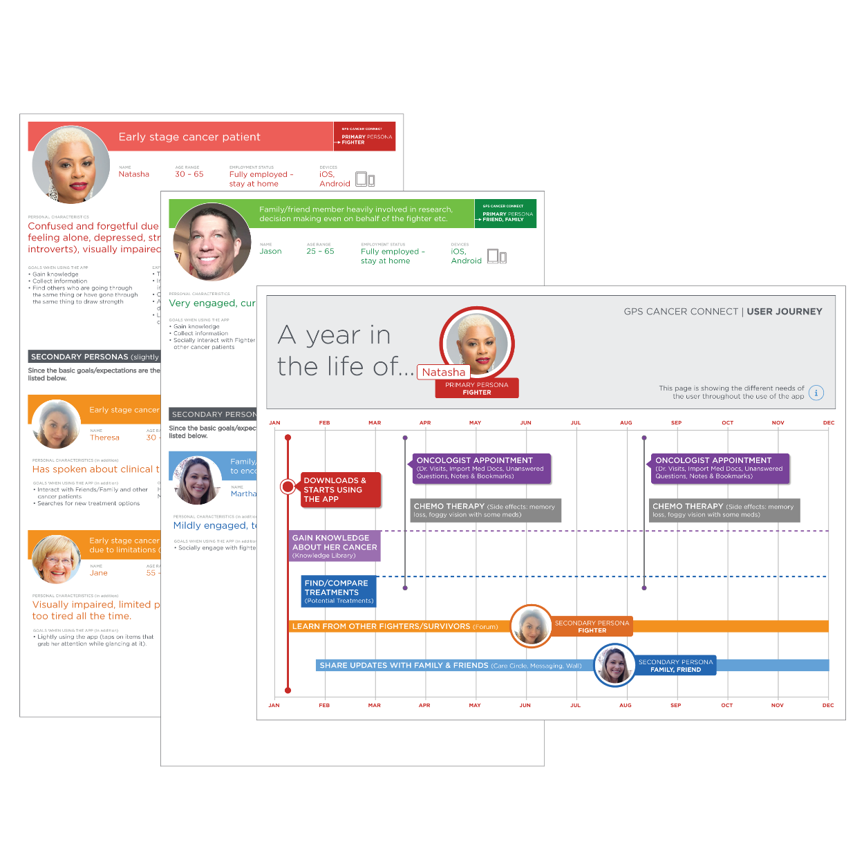
Understanding THE User JOURNEY
To understand the users' needs, we scheduled a persona workshop to define the user roles that were later validated in field research sessions.
Based on these personas, we defined the user journeys, getting deeper into understanding how the app fits into the life of the different roles of cancer patients.
Usability Test Sessions
During the persona efforts, the team clarified the user roles, which gave us direction in recruiting for the upcoming usability testing sessions. After creating a solid test plan, we recruited patients and cancer survivors.
All participants provided us with beneficial feedback. The app's features and content were helpful to them, and we gained insight into areas that needed improvements.